CSS For Me
I am a front-end developer, currently working at TCS.
Attributes Selector
[disabled] {
    color: red;
}
CSS COMBINATORS
Adjacent Sibling -> +
div + p {
    // All paragraphS that directly follow the div tag
    // <-------NOTE------->
    // Elements share the same parent
    // Second element comes immediately after first element
}
General Sibling -> ~
div ~ p {
    // All paragraphs that follow the div tag,
    // doesn't have to be direct sibling
    // <-------NOTE------->
    // Elements share the same parent
    // Second element comes after first element
}
Child -> >
div > p {
    // All paragraphs that are direct child of the div tag
    // <-------NOTE-------->
    // Second Element is direct child of the div element
}
Descendant
div p {
    // paragraphs that are direct child of the div tag
    // doesn't have to be direct child
}
Margin Collapsing
If we have two block elements next to each other then the margin between them is actually collapsed to one margin, and the bigger margin wins.
To work around this it's a good practice to use either margin-top or margin-bottom.
Display: none
It removes the element from the document flow but the element does exist in the DOM.
Extra Space Glitch
If we have extra spaces in our HTML structure then those extra spaces are considered as a character which is an inline element.


Pseudo Classes And Pseudo Elements
Pseudo Classes: Defines the style of a special state of an element
/* unvisited link */
a:link {
  color: #FF0000;
}

/* visited link */
a:visited {
  color: #00FF00;
}

/* mouse over link */
a:hover {
  color: #FF00FF;
}

/* selected link */
a:active {
  color: #0000FF;
}

/*the selector matches any <p> element that is
 the first child of any element:*/
p:first-child {
  color: blue;
}
Pseudo Elements: Defines the style of a specific part of an element
/*formats the first line of the text in all <p> elements*/
p::first-line {
  color: #ff0000;
  font-variant: small-caps;
}
More on CSS Selectors

How to check compatibility
Also, we use mdn docs to check it.
Element Positioning
By default position: static.
We have four more:
Absolute, Relative, Fixed, and Sticky.
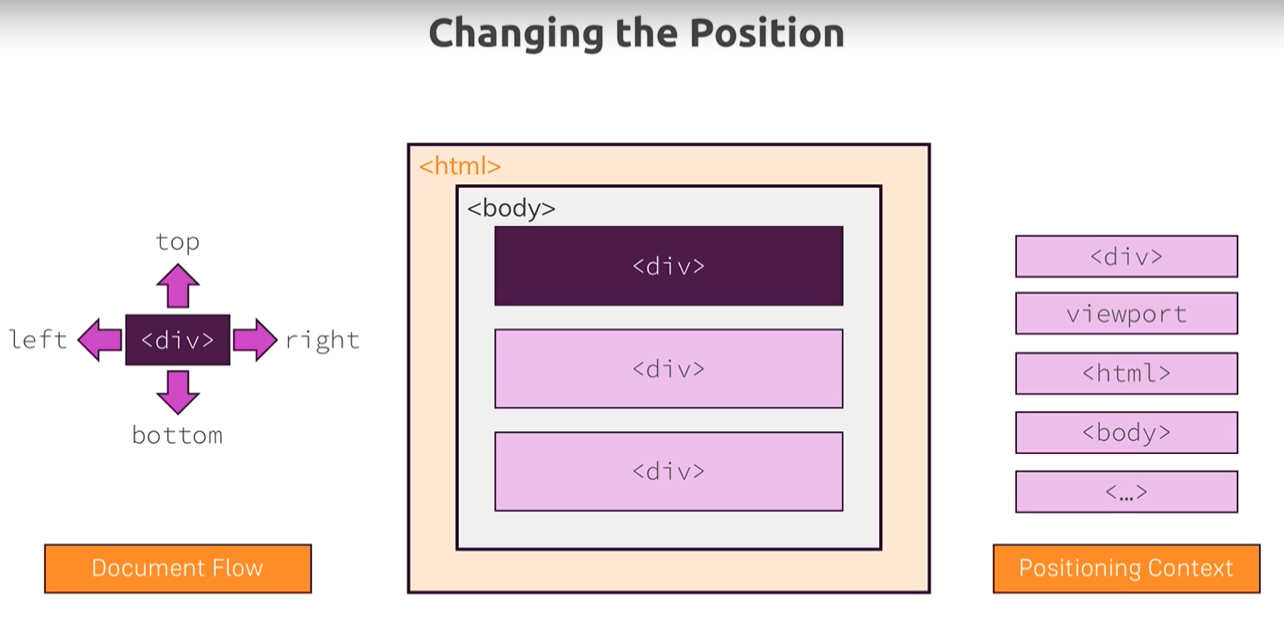
Let's learn all of these one by one
Fixed:
It took the element out of the normal document flow. Now the element is considered not to be present by the other elements.
The element starts behaving like an inline-block element. This works the same for both an inline element and a block element.
Positioning Context: Viewport
Absolute:
It took the element out of the normal document flow. Now the element is considered not to be present by the other elements.
The element starts behaving like an inline-block element. This works the same for both an inline element and a block element.
Positioning Context: (HTML element and Another element)Depends on the two cases:
If its no ancestors have the position property applied: In this case the positioning context will be the HTML element.
If its ancestors have the position property applied: In this case it will be positioned relative to the nearest ancestors who have the position property applied.
Relative:
Element is not taken out of the normal document flow, it stays the same as before applying any position property.
But the cool thing is you can still use top, bottom, left, and right properties to position it.
Positioning Context: The element itself
Overflow Glitch
Sticky Position
The sticky position is a kind of hybrid positioning. It's a combination of relative and fixed positioning.
When we apply position sticky to an element, at starting it behaves like a relative position i.e. there is no effect in the document flow. Once we apply top or bottom etc. it will start to behave like fixed but with some specific cases.
Like as soon as it's reaches the distance that we give to the viewport It starts behaving like fixed and as soon as the content of its parent finished and reaches the viewport then it will simply stop behaving like fixed.
Positioning Context: Viewport and Another element
What is Positioning Context
Defines the anchor point for your position change.
Stacking Context
A new stacking context is created for an element if we apply fixed/sticky or absolute/relative in combination with z-index.
Defines the stacking behavior of child elements.
Background Images
background-size width height;
if we don't specify height then height will be automatically calculated to keep the original aspect ratio of the image.
cover: It ensures that the image covers the whole container while maintaining its original aspect ratio. May be full image is not visible but it will cover the whole container.
contain: It makes sure the original image is fully visible and in this case, the extra spaces can be left in the container.
background-position: x-axis y-axis
px: If we give a px value then the image will be pushed from the left edge(x-axis) and the top edge(y-axis) will lead to excess space.
%: This works a little differently % value tells CSS to crop n % of an image from the left(x-axis) and from the top(y-axis) to fit in the container. By default is 50%.
center: It tells that crop 50% from all the sides of the image.
The Background Shorthand:
background: URL("") position / size repeat origin clip attachment
Images
If we have a container inside which we have an image then setting the height and width of the container will not affect the image size, the image will always be loaded in its original size.
If we want to make an image do care of its parent size then we have to manually resize the image by selecting it.
Hack
If we have a container inside which we have an image that has width set to 100%, then it leaves an extra white space in the container to fix this:
Linear-Gradient
Radial-Gradient
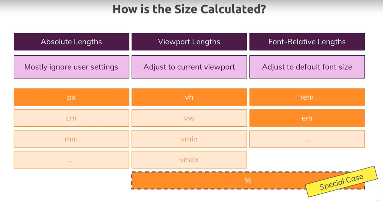
Sizes And Units
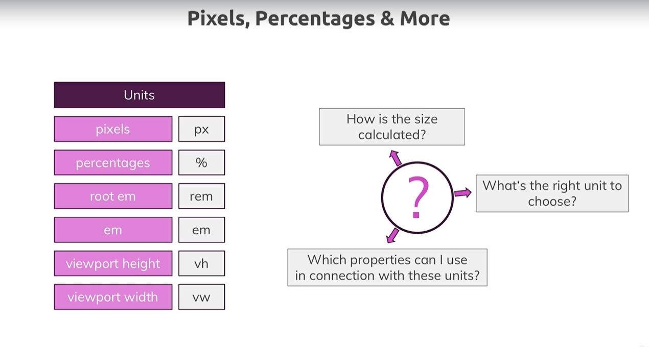
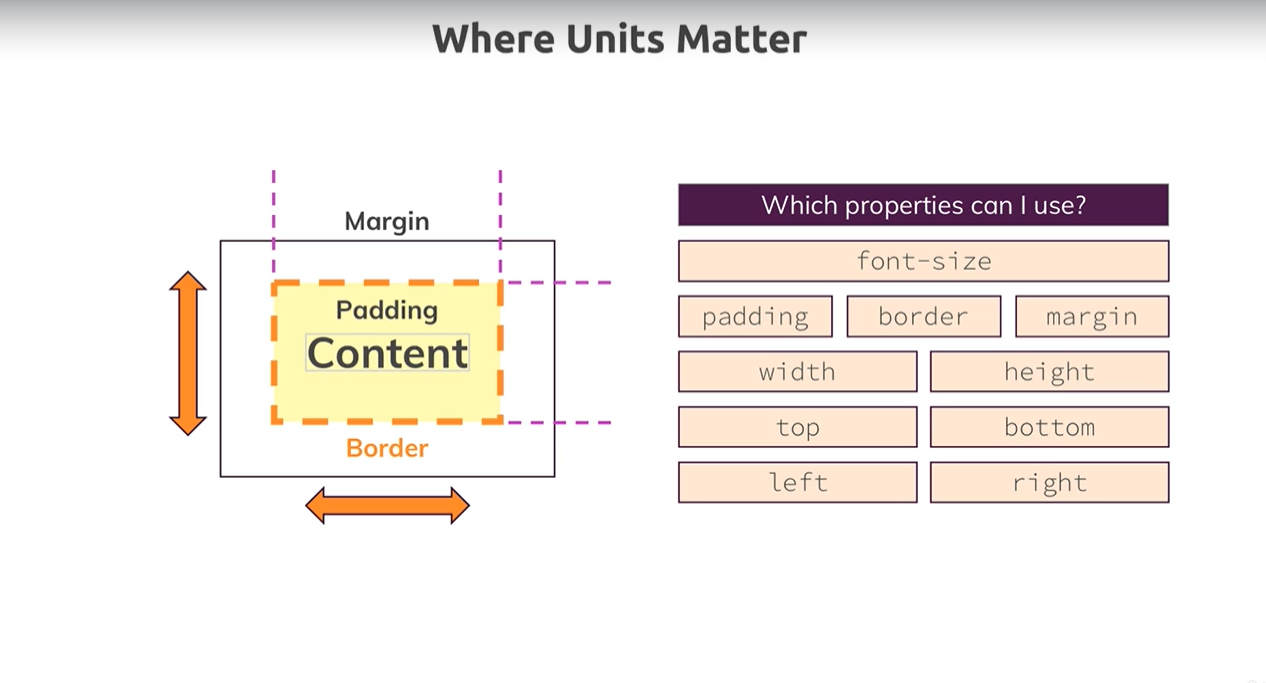
Rules To Remember
Fixed Positioning & %:
Containing block -> Viewport
Absolute Positioning & %:
Containing block -> Ancestor content + padding
Ancestor -> The closest ancestor who has the fixed/relative/absolue/sticky positioning.
NOTE: If there are no ancestors with position fixed/relative/absolue/sticky then, in this case, it will work exactly like Fixed Positioning (i.e. Containing Block -> Viewport)
Relative/Static Positioning & %:
Containing block -> Ancestor content
Ancestor -> The closest ancestor that is a block-level element.
Containing Block: the element or viewport the % value refers to.
VMIN & VMAX
vmin and vmax represent the maximum and minimum viewport dimensions. For example, if you were on a phone that is 300px wide and 800px tall, vmin would represent the width of the viewport and vmax would represent the height of the device. These units are really useful if you need to size an element based on the smallest/largest dimension of a screen. For example, the following CSS will create a square that is as large as possible without overflowing in any direction since it will never be larger than 100% of the smallest screen dimension.
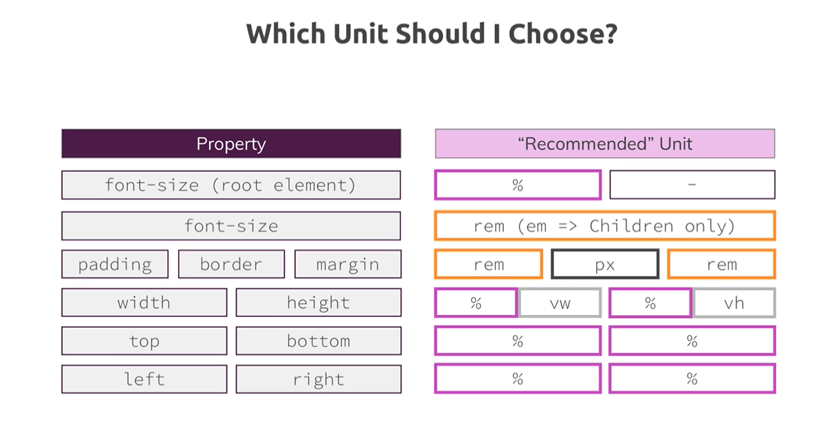
Choosing The Right Unit
Responsive Design
Media Queries
/*MOBILE-FIRST Approach*/
/*Apply following rules if device has width of 40rem or larger*/
@media (min-width: 40rem){
    /*CSS Rules*/
}

/*WE CAN SPECIFY MULTIPLE MEDIA QUERIES*/
@media (min-width: 60rem){
    /*CSS Rules*/
}

/*NOTE 1: Make sure that they are in order
        (lower width comes first if we are using min-width)
        otherwise second media query will override the previous one*/
/*NOTE 2: Adding all media queries at the bottom after all the css rules in
        a css file is a good practice.*/

/*NOTE 3: We can use logical operators to combine more that one rule*/

/*Following rules will be applied if both the conditions are true*/
@media (min-width: 40rem) and (orientation: landscape){
    /*CSS Rules*/
}

/*Following rules will be applied if either of the two conditions are true*/
@media (min-width: 40rem), (orientation: portrait){
    /*CSS Rules*/
}
Advanced Attributes Selectors

Styling Browser-styled elements like checkboxes and select elements.
input[type = "checkbox"]{
    border: 1px solid #ccc;
    background: white;
    width: 1rem;
    height: 1rem;
    /*Following lines will disable the by default styles*/
    -webkit-appearance: none;
    -moz-appearance: none;
    appearance: none;
}
input[type = "checkbox"]:checked{
    border-color: green;
    background: #2ddf5c;
}
Understanding Font & Font Families

/*First browser will find montserrat if it is not present on the user's
  computer then it will go and find verdana if it is also not present then
  it will just apply by default user's preference in his browser's font
  settings under the sans-serif family
*/
font-family: "Montserrat", "Verdana",  sans-serif;
FLEXBOX
When we apply flex to an element we automatically apply two extra properties
flex-direction: row;
flex-wrap: nowrap;
In this case, the following will happen,
The element will become a flex-container
Children will become flex-items
flex-items will become inline-block elements
if we don't specify the width of the flex item then it will take the width that is required to contain its content
If we do specify the width then it will simply take that width
The flex items will start taking the entire height that is available inside the flex container.
If we somehow reduce the width of the flex-container then flex items will start reducing their width until it has enough width to contain its content.
flex-direction: column;
If we apply this property then flex-items will simply act as a block element thus it will take all available width but take height only for content;
But flex items will still be shrunk until it has enough space for their content which is not possible with block elements if we have not used a flex box.
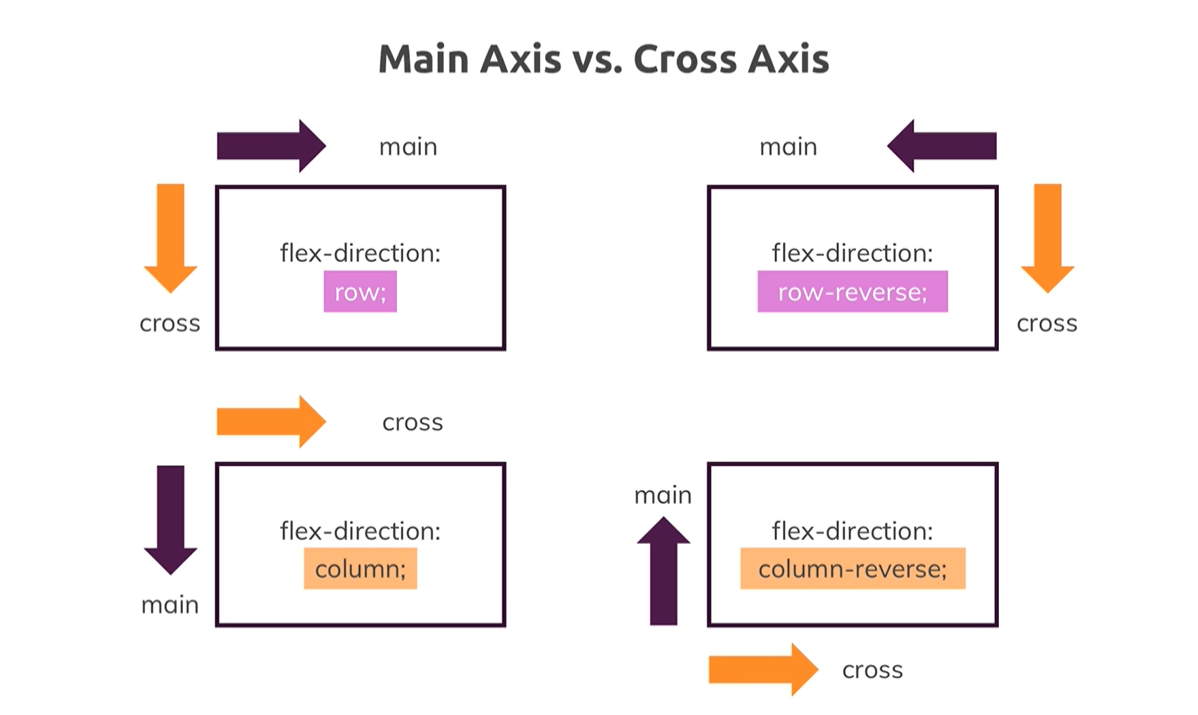
Main Axis VS Cross Axis
align-items
By default (align-items: stretch;), all flex items take all the available height in the flex container. It means we have defined the height of one the the flex items then all flex items will be stretched and will take that same height.
We can change this behavior by applying different values to the align-items property.

Flex-Grow (Flex Item Property)
Default Value: 0
How Does It Work?
Actually, first, the empty space in the flex container is calculated and then it is divided by the value (cumulative of all items) that is applied to flex items and now added to the flex items according to their flex grow values.
Flex-Shrink (Flex Item Property)
Default Value: 1
flex-shrink: 0 -> It means the flex item can not be shrunk more than the defined width.
Flex-Basis (Flex Item Property)
Flex-Basis simply defines the size of an element depending on the main axis. flex-basis is not the width or the height it actually can be both depending on the flex-direction.
CSS Grid
display: grid;
It will by default create 1 column and n rows. where n is the number of child elements.
grid-template-column: 200px 20% 1fr fit-content(8rem);
fit-content -> default column size is 8rem but if content grows the column also grows.
grid-template-columns: repeat(auto-fill, 200px); -> It tries to lay down as many items as possible in a row and starts wrapping as soon as it hits the position where the item can not be placed.
CSS Transforms & Transition
Transform: rotate(deg) translate(px/rem/etc) skew(deg) scale(1/2/3/etc)
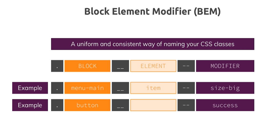
Block Element Modifier (BEM)